Saturday, March 7, 2020

Why is the CDC Suppressing Coronavirus testing in Washington State?

As many of you may know, Washington State has been ground zero for the COVID-19 coronavirus outbreak in the US. As of this writing 16 of the 17 deaths in the US are from Washington State (and 15 from a single county in the state). Below is total attributed deaths worldwide. You can view the most recent numbers here.


Washington State also makes up the largest portion of confirmed cases in the US.


These numbers will change by the time I post this since some more limited testing is finally starting to take place but in reality these 'confirmed' numbers are pretty useless at this point because they are grossly under-reported due to a complete and total lack of testing.

It wasn't only a problem of test kits....it was also a problem of policy.

Until very recently the CDC only allowed people to be tested if they had visited an affected foreign country or could prove they were in contact with someone who had. A completely idiotic policy.
"The new criteria allow people to be tested who have severe respiratory illness with no other explanation, even if they have not traveled to affected countries or have been in contact with a known coronavirus patient, he noted."
Ok, that sounds promising right? It's obviously on US soil so we should be testing a much broader range of people to better gauge the spread, right? However, not even a week later local hospitals are ALREADY putting a break on testing at the guidance of the CDC for a completely opposite reason.

H/T to twitter user @Noneya_Mindyers (highlighting is mine)
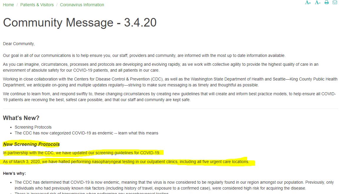
That is from EvergreenHealth which includes the hospital in Kirkland, WA where the majority of Coronavirus deaths in the region have occurred. EvergreenHealth also has a network of outpatient clinics and urgent care locations throughout the region.

So at first the CDC doesn't want people tested because they don't think it has spread enough to warrant testing unless you have traveled.....but NOW they don't want people tested because IT HAS SPREAD TOO MUCH?!? 

After seeing that post I went to look for myself and saw the message described in that tweet. But now this is what you get....
However, google still has it indexed

And fortunately the internet rarely forgets. While I wasn't able to pull-up that exact page....I was able to get their Community Message for  3-4-20 from the way-back machine internet archive which contained largely the same message https://web.archive.org/web/20200307153209/http://www.evergreenhealth.com/community-message-3420


The more concerning questions is WHY WAS THIS MESSAGE DELETED? I have received no response via twitter. It doesn't appear that it is because this policy has been reversed....it appears that it was deleted because it had received attention and they don't want the policy on public display. 

Why is the CDC so set on limiting testing? Would love for EvergreenHealth to clear up this confusion.....As they should know, communication is key during a public health crisis.

Saturday, February 8, 2020

Obama Dominated Trump In Job Growth

Trump loves to pretend job growth has been unprecedented under his watch. However, pesky facts tell another story. I looked at job growth for every monthly rolling 3-year period starting when Obama took office in the depths of the Financial Crisis in 2009.


Just The Facts......

Sunday, April 14, 2019

Trump on Unemployment. Then vs Now. Don't Forget....

Very little time goes by these days without Trump bragging about the official unemployment numbers.........


This despite the fact he went around his whole campaign attacking those numbers as "Fake" and "Phony" because it had been falling under Obama......


Just another day in Trump gaslighting the American people. The reality is the unemployment rate is correct, people just need to understand the nuances in the way in which it is measured (which is why there are so many different variations). However, regardless of how you measure it....It's all going to point to some variation of this....showing Trump has had NO EFFECT on the trend....
Chart via @TBPInvictus

Saturday, November 11, 2017

Some Serious Thoughts on Bitcoin

Is Bitcoin in a bubble? Here are some things to consider....provided without comment.....


Saturday, April 29, 2017

How Global Investor Allocations Have Changed Since the Financial Crisis

Here are some charts I put together using global Morningstar data on all worldwide open-end funds, ETFs and Money Markets. 
To better illustrate the change in values I have segmented the period prior to the Global Financial Crisis, the bottom of the Global Financial Crisis and Today.
Total worldwide fund assets have grown from about 15 Trillion prior to the Global Financial Crisis to over 30 Trillion today. Meanwhile, as the chart below illustrates, despite the never ending talk of mysterious "cash on the sidelines" the percentage of global fund assets in cash today is lower than prior to the Financial Crisis.
 Food for thought.

Monday, February 6, 2017

Where Active Fund Investors Were Flocking to & Fleeing From in 2016

We all have heard about the ongoing industry shift from Active to Passive Funds as illustrated below via Morningstar
However, despite Active funds as a whole being in net redemptions...there are still net winners and losers. Below I have highlighted the Active Mutual Funds within the largest 15 Morningstar categories with the most net inflow and most net outflows in 2016.

While this does tell you investor preference for 2016.....it also might just highlight investor short-termism. While some may have been due to legit concerns about a recent manager departure (Virtus Emerging Markets Opp and Pimco Total Return come to mind). A lot could have simply had to do with bad performance the year before in 2015. In fact, of those listed with the most outflows....11 of the 15 lost to their benchmark in 2015.

However, it seems investors may be overly focused on shorter term returns, because heading into 2016 12 of those 15 funds with the most outflows had records of 10yrs or more.....and 9 of those 12 beat their benchmarks over that timeframe. While each situation is unique, history says investors shouldn't be given the benefit of the doubt....they historically make bad timing decisions when it comes to hiring or firing managers.

Monday, December 12, 2016

Why Do Unified Republican Governments Always Lead to Crisis?


While I believe the purpose of these types of headlines and tweets are to illicit positive emotions, readers would be well advised to look up the DISASTROUS history of extended periods of unified Republican governments. 

In fact, the ONLY 3 PERIODS of extended unified Republican governments going back to 1900 ALL DIRECTLY led to banking crises....Arguably the 3 worst in US History. To be clear, I am defining 'extended' unified governments as anytime they control the House, Senate and White house for at least 4 years. This does not include short 2 year stints since it's hard to screw things up that quick (FYI there was only 1 period of that anyway, 1953-1955). You can look up the periods yourself here and more detail here.

The list of Unified Republican Government crises include the Panic of 1907The Great Depression, and the Financial Crisis of 2007-2008. Interestingly, the record of extended Republican control of Congress has also only led to crises. There have only been 4 periods of extended Republican control of Congress (3 of which overlap with the periods of full unified control just mentioned). However, the 4th period (I KID YOU NOT) ended in the 2000 DotCom Bust where the Republicans controlled the House and Senate from 1995-2001.

In short, full Republican control has NO history of making America great...let alone AGAIN. Don't feel like checking out that history yourself? Here's what you'll find....
Technically Republicans took control in 1895 but this graph does not start there. And While I mentioned the Panic of 1907......I will just brush off the Panic of 1901. Markets fell over 43% before bottoming after both events. How they were not thrown out until 1911 is anyone's guess.

Then we have the Great Depression fuelled by the unsustainable laissez-faire polices of the roaring 20's.
Only led to the greatest market decline in history and total social devastation.....Is that the type of "Great" we want to make again? 

Oh and then we have the Financial Crisis of 2007-2008
This case meets the minimum for "extended" by getting to 4 years (although technically they almost had 6 full years as only 1 independent tipped the senate democrat in 2001). Again lax regulations created the housing bubble which popped in 2006 and lead to our famous bank failures and financial crisis. (Case Shiller housing price index)

While the Republicans managed to get kicked out of Congress in 2007 the coming disaster was already well in motion by then.

While that wraps up the History of the 3 worst banking crises in American History...or um....I mean the History of the "Unified Republican Government". It would not be complete without completing it with the final piece to the history of the extended Republican control of Congress....which is only complete with the DotCom Bust of 2000.
There we have it folks! The disastrous history which has accompanied EVERY extended Unified Republican Government (or control of congress) since 1900. Think I'm missing a period that didn't end in disaster? Check for yourself. I'm not.

Saturday, January 30, 2016

Analyst Price Targets Gone Wrong

So I was recently browsing a report by FactSet which aggregates analyst price target data for stocks. So for fun, I went back to last year's report to see what was said and how things turned out.....Results? Ugly.

First, I looked at their interesting chart which shows the top 10 stocks in the S&P 500 whose price at the start of 2015 was most significantly below its aggregate analyst price target.

The average of these 10 stocks were 45.7% below their price targets. Wow, sounds awesome, why not just make a portfolio of these 10 stocks and roll with it...+47.5% returns here we come! Well, here is how that would have turned out.

No, I did not reverse the signs....they actually were THAT bad! They had the average % return correct.....JUST IN THE WRONG DIRECTION!! Remember folks....the S&P 500 returned +1.4% in 2015, if you equal weighted all 500 stocks it still would have been only -2.2%. It's quite a feat to do this badly.

How about the stocks whose aggregate price targets were most BELOW their starting price in 2015? The stocks they thought would do worst?

Here, on average, they expected these stocks to decline -12.1%. And the results?
Well atleast the average fall was close but what I hope your noticing is how much BETTER these did then those expected to perform best. Not only that but this group actually included 4 stocks that were positive and 6 stocks that performed better than the equal weighted S&P 500.

Lastly, how about just a bottom up look at expected sector returns? What were they saying in 2015?
Ok, so they were expecting 6.8% for the S&P and it returned 1.4% but what about if you want to use this to overweight some sectors? How about if you just equal weight the top 5 sectors (Energy, Materials, Industrials, Telecom & Health Care)? That would give you an expected return of 10.0%. Results?

Terrible, enough said.