
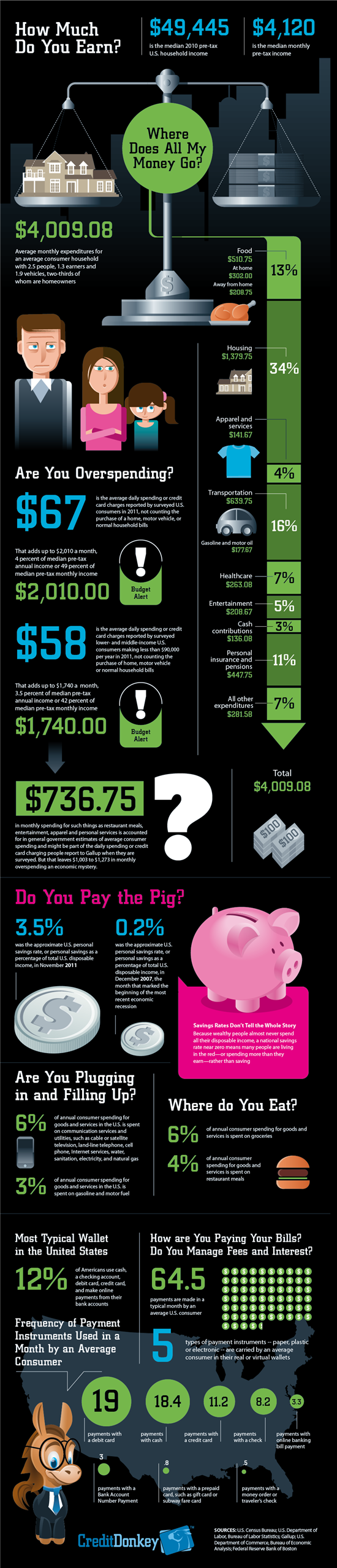
Below is a nice infographic from Credit Donkey on how households spend their money. How does your spending stack-up? I'm definitely over on the percent I'm allocating to the "away from home" food budget. Ah, the downfall of city living!
Am I the only one surprised that the average person in the US still writes about 8 checks per month?


